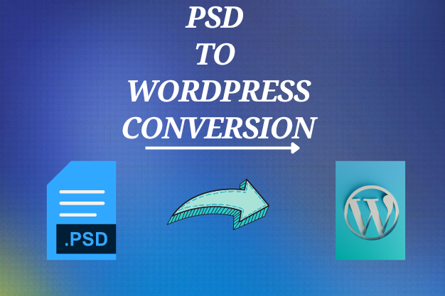
Exploring HTML to Responsive WordPress Web Development

Understanding Responsive Web Development
Responsive web development refers to the practice of creating websites that automatically adjust and adapt to various screen sizes, resolutions, and orientations. It ensures that your website looks and functions optimally across all devices, including desktop computers, laptops, tablets, and smartphones. With responsive design, your website provides an optimal user experience regardless of the device being used.
Responsive web development relies on CSS media queries, which enable different styles and layouts to be applied based on the characteristics of the device. These media queries allow developers to define breakpoints, specifying when certain design elements should adjust to fit the screen size. By using flexible grids, fluid images, and relative units of measurement, responsive web development creates a seamless and visually appealing experience for users.
The Importance of Responsive Web Development
Enhanced User Experience: Responsive web development ensures that users can navigate and interact with your website easily, regardless of the device they are using. The content, images, and functionality seamlessly adjust to fit the screen size, providing a consistent and engaging experience. Users no longer have to zoom in or scroll horizontally to view your website's content, resulting in increased user satisfaction and longer on-site engagement.
Mobile-Friendly: With the growing number of mobile users, having a mobile-friendly website is essential. Responsive design enables your website to adapt to different mobile devices, ensuring optimal visibility, readability, and usability. By providing a seamless experience across devices, you can reach a wider audience and cater to the increasing trend of mobile internet usage.
Improved SEO Performance: Search engines like Google prioritize responsive websites in search rankings. By providing a better user experience across devices, responsive web development positively impacts your website's SEO performance, leading to higher visibility and organic traffic. Instead of splitting your SEO efforts between multiple versions of your site, a responsive design consolidates your efforts into one, making it easier to optimize and improve your search engine rankings.
Cost and Time Efficiency: Rather than developing separate versions of your website for different devices, responsive design allows for a unified approach. This saves both time and resources, as content updates and maintenance can be done in one place. With a responsive WordPress website, you don't have to invest in separate mobile applications or maintain multiple websites, reducing costs and simplifying your online presence management.
Transforming HTML to Responsive WordPress
Converting HTML to a responsive WordPress website involves several key steps:
Planning and Design: Analyze your existing HTML design and determine the desired layout and functionality for your responsive WordPress website. Consider the different breakpoints at which your design elements will adjust based on screen size.
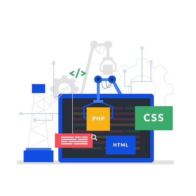
HTML to WordPress Theme Conversion: Develop a WordPress theme by converting your HTML design into PHP, CSS, and WordPress template files. This conversion ensures that your website maintains its design integrity while becoming compatible with the WordPress platform. The use of WordPress's template hierarchy and dynamic content management features allows for easy customization and updates.
Media Queries and Responsive Styling: Implement CSS media queries to define specific styles and layouts for different screen sizes. This allows your responsive WordPress theme to adapt to various devices by adjusting font sizes, image scaling, and column arrangements. By utilizing flexible grids and fluid images, your website will gracefully adapt to different screen resolutions and orientations.
Testing and Optimization: Thoroughly test your responsive WordPress website across multiple devices, browsers, and screen sizes. Address any issues related to layout, functionality, or performance to ensure a seamless and optimized user experience. Regular testing and ongoing optimization are essential to ensure that your website continues to provide a smooth experience as new devices and screen sizes emerge.
HTML to Responsive WordPress with HireWPGeeks
When it comes to transforming HTML to responsive WordPress website, enlisting the expertise of professionals like HireWPGeeks can streamline the process and deliver exceptional results. HireWPGeeks is a trusted WordPress development agency with a team of experienced developers skilled in HTML to WordPress conversion and responsive web development.
With their expertise, HireWPGeeks ensures that your HTML design is seamlessly transformed into a responsive WordPress website. They specialize in creating custom WordPress themes that maintain the integrity of your design while providing optimal responsiveness across all devices. By harnessing their technical prowess and knowledge of best practices, HireWPGeeks delivers fully functional and visually stunning responsive WordPress websites.
HireWPGeeks follows a meticulous process that includes analyzing your HTML design, converting it into a responsive WordPress theme, and conducting thorough testing to ensure optimal performance across devices. With their assistance, you can navigate the complexities of responsive web development with ease and confidence, knowing that your website will deliver an exceptional user experience on all devices.
Transforming HTML into a Responsive WordPress Website
The Power of HTML to WordPress Responsive Transformation
Converting HTML to a responsive WordPress website is a game-changer in today's digital landscape. By harnessing the capabilities of HTML and the flexibility of WordPress, you can create a visually stunning and user-friendly website that seamlessly adapts to different devices and screen sizes. HTML serves as the foundation, providing the structure and content of your website, while WordPress empowers you with a dynamic and customizable platform. Through the process of transforming HTML to WordPress responsive, you unlock the power of responsiveness, ensuring that your website delivers an optimal viewing experience across desktops, laptops, tablets, and mobile devices. With responsive design, your website becomes accessible to a broader audience, enhances user engagement, and boosts your online presence. Embrace the transformative journey of HTML to WordPress responsive and unlock the full potential of your website.
Conclusion
Responsive web development has become a necessity for businesses aiming to deliver an outstanding user experience across devices. By transforming HTML to a responsive WordPress website, you can unlock the power of responsive design, adapt to the ever-evolving digital landscape, and provide a seamless experience for your website visitors. Whether you choose to undertake the conversion process independently or seek professional assistance from HireWPGeeks, embracing responsive web development is a vital step towards success in the modern online world. Embrace the power of HTML to responsive WordPress and unlock the true potential of your website.

Comments
Post a Comment